Wednesday, June 15, 2011

Newport Bible Study Invitation

Here's an invitation that I made for a bible study my youth hosts during the summer for Russian students that come to Newport, RI for employment.

Front

Back


Wednesday, May 18, 2011

CD Cover

We're working on creating a CD design. Including band name, album name, lyrics, song names, and the designs to go with them. My band name is "The Betrothed". The album is "Two Hearts". Just finished the CD cover. Check it out :)

Friday, April 29, 2011

Love it!


Made my Day :)

Just thought this was really clever :) You can find even more amazing photoshopped images here. Check it out!
John Sayles Design Co. is the product of 25 years of experience in the design field. Each design is created by collaboration among the whole team, producing the ideal end product. The company has been  a recipient of over 1000 awards in design excellence over the years.  I used on of the designer's logos as almost a template for my design, utilizing the primary colors as well as some funky shapes to try and mimic the designer's style.

Friday, April 8, 2011

Packaging

Found this packaging design on one of the links from the class blog. Here. What appeals to me is the vintage look. The hand drawn element makes the packaging more personal, not so corporate. The design itself is very strong in utilizing space to sell the product effectively. 


Thursday, March 24, 2011

Taking a firm stance.

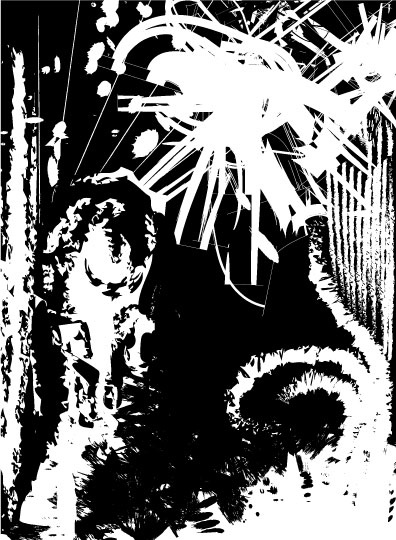
"Be sure you put your feet in the right place, then stand firm." Abraham Lincoln

This is actually a portrait of abraham lincoln, using only the words from the quote above. By using a clipping mask after manipulating the text to his face, I was able to create a sense of value and definitely some movement. The assignment was to create a portrait based on a quote. I made it my own by actually working with the text one-on-one :] I redid this design almost three times until I figured out how to manipulate the text well enough. Hope you like it, it's probably my favorite design so far :)

Friday, March 18, 2011

William Morris

Here's an artist that I found intriguing. William Morris. Mostly he does wallpapers and such, but the detail to which his designs go is unbelievable. I really like how each design has a vintage feel, as if it could be the wallpaper at an old inn. He had a very floral theme going on, but it isn't too much that turns you off. You can check out some of his images here.


E-motions

Here's what I've been working on a couple weeks. The last one is definitely my favorite. I used bolder colors and emphasized on the man yelling. The 'LOUD' coming from his mouth is in the shape of a megaphone. Then I created a balance by repeating the same word over and over. The assignment was to choose an emotion word and create a design to express the feelings associated. This design actually came the easiest. Once I started, I didn't even really have to think about the next step.

Tuesday, March 1, 2011

In Between the Lines

Logo designs utilizing negative space :: The first is my friend Daybar's clothing line company name. She's working on getting a site up to display and sell her work. Notice the spool of thread in the 'O'. Second one is my initials, GR. Within the backwards R, a G is created in the white space. It was difficult  to figure out where to use negative space and incorporate the company's purpose at the same time.

Friday, February 18, 2011

Turmoil


Here's to #2. This here is my gradient design. Shape and value are the two most evident elements of design that I incorporated. The effect of the melting squares in the center allows the gradients to flow more smoothly. Harmony is also very prominent in this piece because of how all the shapes flow together. The assignment was to create a design using each of the tools found on Illustrator that deal with gradients. I made the design my own by creating a sense of fluency not only by use of gradients, but also in the way the design was structured. I didn't plan much, but basically just grew off an initial idea to make something "melting", like paint. Hopefully that's how it turned out :)

Friday, February 11, 2011

Line Design

Here's my first design of the year. Definitely just getting used to Illustrator, so don't hate :)